Signature Contest Public Judging
|
|
Post by Rock on Jun 15, 2011 19:48:28 GMT
Do it in this thread. GGoodie: ![]() i51.tinypic.com/4keoue.png i51.tinypic.com/4keoue.png[/img] mdog95: 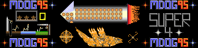 sparkpowder:  Nmagane:  izaque:  shkids:  Monokr0me:  justlurking:  Rock:  Memzak: ***  Draxorion:  Rubiksmaster123:  Kurai Oorora:  Anonymousperson5:  pRiok:  *** Entry pending.
Seeing as so many people have entered this contest, I am adding a 4 th place prize. Prizes: 1 st Place 1,500 Dan-Balls, 5 Karma, Winner Badge 2 nd Place 1,000 Dan-Balls, 4 Karma 3 rd Place 800 Dan-Balls, 3 Karma 4 th Place 600 Dan-Balls, 2 Karma Special Prize 600 Dan-Balls, Special Badge Entry Prize (not given to winners) 75 Dan-Balls, Virtual Cookie Badge
Please judge each entry using the following criteria: Beauty: 50/100 Originality25/100 Neatness: 10/100 Creativity: 15/100 Judging will end on July 5 th, 2011. You may not judge if you have participated in the contest. If your judging seems biased, it will not be counted. |
|
|
|
Post by james on Jun 15, 2011 19:56:50 GMT
Mdog's isn't showing for me...
|
|
|
|
Post by Fringe Pioneer on Jun 15, 2011 20:03:41 GMT
If necessary, you may use this table to help keep things nice and orderly, and to let us easily determine how each of you judged for someone. Simply quote the post, remove the quote tags, remove these first two sentences, and replace the x's with the scores you think are appropriate for each of the categories. | Contestant | Beauty (out of 50) | Originality (out of 25) | Neatness (out of 10) | Creativity (out of 15) | | GGoodie | x | x | x | x | | mdog95 | x | x | x | x | | Sparkpowder | x | x | x | x | | Nmagane | x | x | x | x | | izacque | x | x | x | x | | shkids | x | x | x | x | | Monokr0me | x | x | x | x | | justlurking | x | x | x | x | | Rock | x | x | x | x | | Memzak | x | x | x | x | | Draxorion | x | x | x | x | | RubiksMaster123 | x | x | x | x | | KuraiOorora | x | x | x | x | | Anonymousperson5 | x | x | x | x | | pRiok | x | x | x | x |
|
|
|
|
Post by Rock on Jun 15, 2011 20:27:39 GMT
Yeah, mdog's isn't showing up. I'll have to go try again.
|
|
|
|
Post by Anonymousperson5 on Jun 15, 2011 21:15:03 GMT
A lot of people joined. I do believe we may have only a few people judging.
Mine and Priok's are teh best!!!
Lol.
|
|
|
|
Post by Rock on Jun 15, 2011 21:23:53 GMT
I wouldn't say best, izac's is stunning, but you and him may have a chance of winning the special badge for your unique styling.
|
|
|
|
Post by kuraikiba on Jun 15, 2011 21:37:09 GMT
| Contestant | Beauty (out of 50) | Originality (out of 25) | Neatness (out of 10) | Creativity (out of 15) | | GGoodie | 30 | x | 5 | 14 | | mdog95 | 27 | 20 | 7 | 10 | | Sparkpowder | 14 | 12 | 4 | 3 | | Nmagane | 28 | 18 | 7 | 10 | | izacque | 40 | 25 | 8 | 14 | | shkids | 14 | 17 | 2 | 8 | | Monokr0me | 38 | 24 | 8 | 13 | | justlurking | 22 | 20 | 5 | 10 | | Rock | 30 | 19 | 7 | 8 | | Memzak | 37 | 20 | 10 | 14 | | Draxorion | 29 | 23 | 9 | 14 | | RubiksMaster123 | 33 | 17 | 8 | 12 | | KuraiOorora | 35 | 22 | 9 | 11 | | Anonymousperson5 | 20 | 15 | 4 | 12 | | pRiok | 25 | 14 | 7 | 10 |
GG: Creative, but slightly messy in parts. May be part of the style, but wasn't for me. Mdog: Memorized his earlier. Creative little bit, though pixel art is a bit overdone these days. Sparkpowder: About 5 minutes in MS paint worth. It's sloppy, uncreative, and a mess. Nm: Though I am not a fan of macs, I liked the creativity behind the idea, though was not jazzed with the arrangement. Izacque: Brilliant. Colorful, popping, creative, and pixel art to boot. An intense piece, and quite a work! I loved the colors, and the way the beams (That's what I called them) blast at each other, with a fiery repulsion. Shkids: Quite bad. MS paint, little creativity, sloppy, an overall mess. Monokrome: Creative indeed, unlike any other any in form or style. The very blend with the background is perfection, a marvel of 3D art. Justlurking: Not bad, but not great, though I love the interesting concept. Rock: Quite... patriotic. A nice ode to Dan Ball, if not haphazard at points and times. Memzak: Creative piece, and the faint aura that slowly fades into the background is the incredible part of this work. Well done! Drax: Plain, yet bold. Organized, yet wild. A seemingly duality of a sig, and a contender for sure. Rubik: Clever, love the flare effect. Could've been more intricate though. KO: Serene, calm, and tranquil. A peaceful piece, and a well organized one. A5: A nice little piece of homage to PG. Quite clever. Priok: As usual, Priok shows his interesting skill with pixel art. It seems like some of his others though. Would've liked a bit more of an original bit. |
|
|
|
Post by Anonymousperson5 on Jun 15, 2011 21:52:46 GMT
I think a "Total" column is in order.
Lol 51 outta a hundred.
And I think you need to nominate the special award winner.
EDIT: Homage to PG? I spent tons of time screening and copying and cropping perfectly every single game on Dan-Ball. And the misshapen sections are the effect of a collage. Oh well, it's you judging, eh?
|
|
|
|
Post by monokr0me on Jun 15, 2011 22:07:04 GMT
| Contestant | Beauty (out of 50) | Originality (out of 25) | Neatness (out of 10) | Creativity (out of 15) | Total | | GGoodie | 30 | x | 5 | 14 | 49? | | mdog95 | 27 | 20 | 7 | 10 | 64 | | Sparkpowder | 14 | 12 | 4 | 3 | 33 | | Nmagane | 28 | 18 | 7 | 10 | 63 | | izacque | 40 | 25 | 8 | 14 | 87 | | shkids | 14 | 17 | 2 | 8 | 41 | | Monokr0me | 38 | 24 | 8 | 13 | 83 | | justlurking | 22 | 20 | 5 | 10 | 57 | | Rock | 30 | 19 | 7 | 8 | 64 | | Memzak | 37 | 20 | 10 | 14 | 81 | | Draxorion | 29 | 23 | 9 | 14 | 75 | | RubiksMaster123 | 33 | 17 | 8 | 12 | 70 | | KuraiOorora | 35 | 22 | 9 | 11 | 77 | | Anonymousperson5 | 20 | 15 | 4 | 12 | 51 | | pRiok | 25 | 14 | 7 | 10 | 56 |
|
|
|
|
Post by mdog95 on Jun 15, 2011 22:14:16 GMT
You got a bad link, Rock. It still shows in my sig but not in the thing.
|
|
|
|
Post by Rock on Jun 15, 2011 22:20:51 GMT
Oh, sorry about that. Anyway, how is mine not creative?
|
|
|
|
Post by Fringe Pioneer on Jun 15, 2011 22:22:24 GMT
Did I fix it and put up the correct image?
|
|
|
|
Post by Rock on Jun 15, 2011 22:24:29 GMT
Yeah, it's the right one.
|
|
|
|
Post by mdog95 on Jun 15, 2011 22:28:32 GMT
I can understand the beauty not being so high, but how is the originality and creativity 5 under? There is absolutely nothing else like it except for the stuff I made...
|
|
|
|
Post by Rock on Jun 15, 2011 22:43:17 GMT
Well, hopefully others will judge, I don't agree with kurai's views on quite a few pieces, including my own.
|
|
|
|
Post by FoxtrotZero on Jun 15, 2011 22:59:47 GMT
| Name | Place | Beauty | Originality | Neatness | Creativity | Total | | GGoodie | 2/15 | 35/50 | 25/25 | 10/10 | 10/15 | 80/100 | | mdog95 | 12/15 | 5/50 | 10/25 | 0/10 | 0/15 | 15/100 | | Sparkpowder | 14/15 | 5/50 | 0/25 | 0/10 | 0/15 | 5/100 | | Nmagane | 13/15 | 10/50 | 0/25 | 0/10 | 0/15 | 10/100 | | Izacque | 1/15 | 50/50 | 25/25 | 10/10 | 15/15 | 100/100 | | shkids | 15/15 | 0/50 | 0/25 | 0/10 | 0/15 | 0/100 | | Monokrome | Tied 8/15 | 15/50 | 5/25 | 5/10 | 5/15 | 30/100 | | Justlurking | 7/15 | 25/50 | 5/25 | 10/10 | 10/15 | 50/100 | | Rock | 5/15 | 40/50 | 10/25 | 5/10 | 5/15 | 60/100 | | Memzak | Tied 10/15 | 0/50 | 10/25 | 5/10 | 5/15 | 20/100 | | Draxorion | 6/15 | 10/50 | 25/25 | 5/10 | 15/15 | 55/100 | | Rubiksmaster123 | Tied 8/15 | 10/50 | 5/25 | 10/10 | 5/15 | 30/100 | | KuraiOorora | Tied 3/15 | 45/50 | 20/25 | 5/10 | 5/15 | 75/100 | | Anonymousperson5 | Tied 10/15 | 10/50 | 0/25 | 0/10 | 10/15 | 20/100 | | Priok | Tied 3/15 | 35/50 | 20/25 | 10/10 | 10/15 | 75/100 |
There is no fourth place winner, I have nominated two entires in a tie for third place. I nominate Priok for the special award. He placed every pixel by hand. I mean, DAMN. Unfortunately, that wasn't something taken into account during grading. |
|
|
|
Post by Vertigo on Jun 15, 2011 23:01:56 GMT
  Comments: I honestly don't feel like commenting on all of these, if you want to argue about your score, just ask. First- Monokr0me Second-Priok Third-Izacque Fourth-KuraiOorora Special badge - Priok Edit: Commenting on the top 4 and the last 2 as Mono suggested. Mono - 3D signature, I loved it. It managed to be one of the most creative while being one of the neatest. Although, it could have used an extra flare to it, it's really just a block. Albeit, a first place material block. Priok- He gets second place AND special nomination. It was a great sig, by far the best 2d one. He also gets special nomination because he placed every single pixel by hand. I find that to be amazing, really. Izacque - The thing I like the best about this is the symmetry, but it's not really the most original thing I've ever seen. KuraiOorora- Good sig overall, with the specialized O and whatnot. There's nothing really wrong with the piece at all, it just doesn't look awe-inspiring though. Peaceful and calm, as KK7 said. Sparkpowder- It looks like chicken scratch on a colorful background. Nothing really special here, but it's better than anything I could have come up with. Shkids- .....Was this done in paint? It's just a cluster of images, I see nothing appealing about it. If this is your first try at anything graphical, it's not THAT bad. Nobody was good when the first started out; but if you've been out this for a while...I don't quite know what to say. |
|
|
|
Post by GGoodie on Jun 15, 2011 23:25:09 GMT
Neatness?
| Contestant | Beauty (out of 50) | Originality (out of 25) | Neatness (out of 10) | Creativity (out of 15) | Total | | GGoodie | 30 | x | 5 | 14 | 49? |
What is this?
Please do not double post. I'm afraid that you've been here for too long for me to ignore this... -Rock |
|
|
|
Post by GGoodie on Jun 15, 2011 23:36:13 GMT
| Contestant | Beauty (out of 50) | Originality (out of 25) | Neatness (out of 10) | Creativity (out of 15) | Total | | GGoodie | 30 | x | 5 | 14 | 49? |
What is this? |
|
|
|
Post by kuraikiba on Jun 15, 2011 23:59:38 GMT
I meant to put 22 there.
|
|
|
|
Post by mdog95 on Jun 16, 2011 2:00:55 GMT
15% on something I spent 10 hours on? Gee, thanks  |
|
|
|
Post by Qwerty on Jun 16, 2011 13:58:56 GMT
I must say, this has been a particularly effective contest, in both judging and participation. I wish that all contests were this popular.
|
|
|
|
Post by Alonso on Jun 16, 2011 18:43:37 GMT
Foxtrot gave me 0 on everyting, I agree with neatness and beauty, but surely I get something for the other parts?
|
|
|
|
Post by sheep on Jun 16, 2011 19:48:18 GMT
GBaddie: I like the colors in this piece but the "a: without" stuff is pretty cliche.
mfog94: Pretty cool but it looks a little messy in some parts.
izaque: This one is pretty good, it has some cool colors.
mongrome: The concept is pretty cool but the edges look uneven and messy.
justblurging: It looks cool but it is a little too plain I think.
Kurai Ororoarooaroa: Really good
Anonymousbonhome5: It is a good concept but there is a lot of things going on so it is a little confusing.
pRiok: This is very gool, I think the people should have more variation in appearance and actions, the rocks and crystals are very well done.
|
|
|
|
Post by mdog95 on Jun 16, 2011 20:56:18 GMT
Briok is just a cool bud like that. And why do you insist on spelling everybody's name wrong?
|
|
|
|
Post by kuraikiba on Jun 16, 2011 22:30:19 GMT
Sheep is a veteran troll. He spells almost everything wrong, and just causes mayhem.
|
|
|
|
Post by Draxorion on Jun 16, 2011 22:53:12 GMT
|
|
|
|
Post by GGoodie on Jun 17, 2011 2:11:27 GMT
Please do not double post. I'm afraid that you've been here for too long for me to ignore this... -Rock You forgot to delete the second post Also, double posting really shouldn't be warned for when it is only done once. |
|
|
|
Post by Rock on Jun 17, 2011 2:26:23 GMT
Whoops. Except you've been here for years, I can't just ignore it.
|
|
|
|
Post by Draxorion on Jun 17, 2011 2:27:13 GMT
You know, I don't feel like I should even bother complaining about the grading I was given. Good enough for me...
|
|
|


 [img src="http://i.imgur.com/BKhxo.png[/img


 [M:977802]