|
|
Post by mdog95 on Sept 8, 2011 4:01:47 GMT
Just vote in the poll for which sig of mine you think is the best. I'll post every one of them in order of my favorites from last to first. Also say why you voted for what. #6 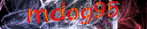 #5 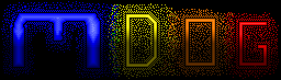 #4  #3 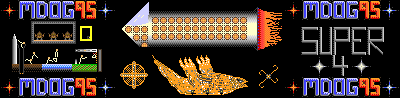 #2 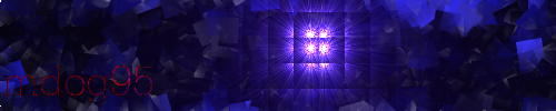 #1  |
|
|
|
Post by nmagain on Sept 8, 2011 11:50:17 GMT
i chose the least ugly one
|
|
|
|
Post by mdog95 on Sept 8, 2011 12:16:51 GMT
cool
And you do realize I'm a newfag at graphic art right? I've been doing it for about... 4 days.
|
|
|
|
Post by izacque on Sept 8, 2011 16:51:20 GMT
I really think you should try to improve these
|
|
|
|
Post by mdog95 on Sept 8, 2011 17:36:50 GMT
 This was done in PS on a computer at school. It took five minutes. I vote I torrent PS tonight =3 |
|
|
|
Post by nmagain on Sept 8, 2011 18:00:42 GMT
dat lens flare
|
|
|
|
Post by mdog95 on Sept 9, 2011 3:37:17 GMT
it is so shiny 0_O
|
|
|
|
Post by priok on Sept 9, 2011 4:12:12 GMT
I think that you're believing your work is better because you've used a different program, the program doesn't really matter. I think that is your worst one, anyway. I vote for #1, but it'd look better without the blur.
|
|
|
|
Post by Draxorion on Sept 9, 2011 4:57:46 GMT
Please do not mention torrenting. GeneralVeers would not be pleased. Also, I vote for #1. The layout is alright, but the colors are not preferable.
|
|
Deleted
Deleted Member
Posts: 0
|
Post by Deleted on Sept 10, 2011 1:02:22 GMT
I still don't like how mdog stole my rainbow name idea.
|
|
|
|
Post by mdog95 on Sept 10, 2011 4:13:44 GMT
Nuh. I just put wind on the name and put a rainbow gradient on overlay. The actual name isn't rainbow; the background is :3
|
|
|
|
Post by priok on Sept 11, 2011 5:01:33 GMT
I really think the #1 signature is better than your current one. I don't know, the current one seems like it just has a lot of layers or something
|
|
|
|
Post by mdog95 on Sept 11, 2011 16:27:10 GMT
My current one has a red supernova with flames coming from it and a very opaque lava layer to simulate an electrical shockwave from the supernova. And the name is just orange with a few spotted gradients and a drop shadow. There's only three layers, not including the drop shadow. The other one also has three layers.
|
|
|
|
Post by priok on Sept 11, 2011 16:30:24 GMT
Well, you know, I am not very good with these layer things. But anyway, I still think that it is not as good, it looks very messy, kind of. I think the green/blue one was the best you've done so far.
|
|
|
|
Post by Likep on Sept 11, 2011 16:39:42 GMT
#6 is my favorite. What did you use to make those sigs?
|
|
|
|
Post by mdog95 on Sept 11, 2011 16:42:09 GMT
GIMP, and how could #6 be anything compared to... all the others?
|
|
|
|
Post by Likep on Sept 11, 2011 18:37:09 GMT
I dunno. It's just awesome IMO. Everyone has their favorites.
|
|
|
|
Post by mdog95 on Sept 11, 2011 19:31:10 GMT
True, true.
|
|
|
|
Post by GGoodie on Sept 11, 2011 19:46:58 GMT
I don't vote for any of them.
|
|
|
|
Post by mdog95 on Sept 11, 2011 21:29:16 GMT
Good one.
|
|
|
|
Post by izacque on Sept 14, 2011 2:08:34 GMT
I believe I can help pRiok to say his words. I think that in your current one, the individual parts don't blend together to make a unified whole. The spirals of fire are very distinct and don't blend, and the lava in the background doesn't have any visible relationship with the supernova and some other things. Basically, the parts seem to be laid on top of each other instead of interacting with each other. The electricity render int eh back, a supernova (which GIMP does poorly, so I'd suggest staying away from that filter), the spirals, and the text on top. In a well done signature, the whole is greater than the sum of the parts because they each help each other. In this signature, it seems that the parts are placed on top of each other. They don't interact, but rather compete for the viewer's attention.
|
|
|
|
Post by mdog95 on Sept 14, 2011 3:55:51 GMT
I couldn't agree more that GIMP isn't very good at rendering supernovas. I think I'll just take everything I attempted to render and just do the drawing by hand. I'm sure that if I draw in a star exploding, since I'm pretty decent at pixel art, and render a few blurs or something into it, it will fit perfectly with the lava layer to create the illusion of energy from the explosion. As for the flames, I'll make them more of a red tone so they match the lava... or maybe I could remake the lava so it's orange. We'll just see which works best. This is the signature I wanted to perfect, so I will do so.
|
|