|
|
Post by Likep on Oct 29, 2011 0:23:11 GMT
More Avatars! I have 2 here: The Graffiti L, and the Metal L (Which is a fixed version of The Big L). Here they are!  The Graffiti L  The Metal L So which one's more awesome? Tell me what you think! |
|
|
|
Post by mdog95 on Oct 29, 2011 1:26:52 GMT
Graffiti = good Metal = same problems. Just too much contrast. This is pretty rough, but try going off of this. And there's more than one way you can make metal text. I still need to figure out how to do it though. 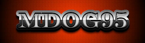 Also use my current sig as reference. I have no idea how I got that effect... so don't ask.  |
|
|
|
Post by Techmyst on Oct 29, 2011 1:28:09 GMT
only if The Graffiti L looked like The Metal L that would be perfect.
|
|
|
|
Post by mdog95 on Oct 29, 2011 2:23:52 GMT
I think you mean the opposite...
|
|