|
|
Post by mdog95 on Sept 20, 2011 17:47:39 GMT
 What happened to the sharpness of it, I will never know... |
|
|
|
Post by izacque on Sept 21, 2011 1:12:50 GMT
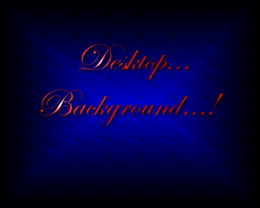
The highlights on the the red Edwardian script ITC letters isn't consistent with any possible combination of lighting. The drop shadow suggests that the words are floating relatively far from the background, but nothing else contributes to this effect, so it doesn't work. the background "noise" is to obviously tiled, it detracts from the image. Gradients don't make good backgrounds on their own. In case you didn't catch it, Edwardian Script ITC isn't really a good font. it has no personality, which is crucial for a cursive font.
The use of color wasn't bad.
|
|
|
|
Post by priok on Sept 21, 2011 2:08:58 GMT
I think the use of color is not bad, but the colors used are bad, if this makes any sense. I don't think it would be too bad, but I agree with pretty much everything Izacque said.
|
|
|
|
Post by Rock on Sept 21, 2011 2:24:48 GMT
I'm afraid I'm going to have to agree with Izac as well. I don't really agree with your choice of colors, but that's just my opinion, and the font is pretty ugly. It's good for a first attempt, though.
|
|
|
|
Post by GGoodie on Sept 21, 2011 2:40:56 GMT
There is nothing redeeming about this image at all. The use of color wasn't bad. Just cut your fluff down to a minimum there. |
|
|
|
Post by mdog95 on Sept 21, 2011 3:09:25 GMT
Meh. I was really only experimenting with things I haven't done yet. I agree with every single thing you all said. This wasn't exactly an involved project for me. I did it in about 20 minutes at 11:30PM. But I will take all of that into consideration if I decide to either fix it or make something similar. So to put it as plainly as I possible can, I put an EXTREMELY small amount of effort into this, mostly just to experiment with textures and gradients and such. My avatar (as of 9-20) was pretty involved, and it turned out really nice. Some of you on the chat saw it full-size. And so you don't pester me, here that is. I'm too lazy to make a separate thread for it.  |
|
|
|
Post by priok on Sept 21, 2011 4:20:28 GMT
It doesn't look bad, but the beveling or whatever on the M looks very weird, I also think that having pictures of star leaves makes it sort of weird. It'd be better if it were a different design of what you have in the background, instead.
|
|
|
|
Post by mdog95 on Sept 21, 2011 4:58:29 GMT
Well, I intended for the image to be my avatar, which is 100x100 pixels, so I made it 1000x1000 pixels to make it easier to work with, and when it's sized down, some things that may look a little weird in the large image, such as the leaves, turns into a cool-looking texture. And the flames, which look very nice in both images, looks a little bit like scratch marks when it fades down into the bottom section. If the image was intended to be viewed at 1000x1000 pixels, I may have done things differently, such as made the texture of the M different.
|
|
|
|
Post by Fringe Pioneer on Sept 21, 2011 12:54:25 GMT
Ah, I guess I will admit that the leaf texture doesn't look like such in the avatar and seems better at 10,000 pixels2...
|
|
|
|
Post by izacque on Sept 25, 2011 13:58:58 GMT
There is nothing redeeming about this image at all. The use of color wasn't bad. Just cut your fluff down to a minimum there. This is how you talk to people who you don't want to see improve... |
|